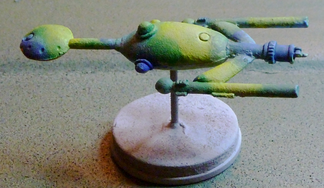
I wanted to try something different for my Sathar ships from
Star Frontiers. I decided to go with a real paint job instead of my usual multi-shade drybrush technique. Here's how it came out:
However, I wasn't sure exactly what I wanted to do, so I tried an experiment, blending a couple shades each of blue, yellow, and green. I was trying for an organic look, but it came out as more of a hippy-ish tie-dyed thing.
I don't know if I'm happy with this or not, so I'd like your opinion: Should I keep this paint scheme, or soak this mini in Pine-Sol and start over? Please let me know what you think, and don't be afraid to be honest.
Bonus work-in-progress pic: a larger Sathar ship, perhaps destined to be a tanker of some sort.


11 comments:
Not bad looking and definitely unique looking. I'd keep it.
A more wet-blend would probably make it look more organic. You might try some washes over the whole things to make transitions smoother (if that's what you're after).
The SS Phish? Why not a sickly green? That somehow seems appropriate for the Sathar to me.
This really doesn't look 'hippy' to me, so much as ethereal and otherworldly, which I think works well on a starship. I like what you've done.
In addition to smoother transitions, suggested by Bighara, it occurs to me that some object-source lighting effects, possibly along the nacelles, originating from the nacelle globes might also enhance the effect.
Meh. I don't mind the color scheme much, but I'd rather see a true camo job.
cool paint job.
I don't know. kind of looks like nebula-cammo, but why would they do it? how often would they be in a nebula? if it's an organic natural coloring that would make sense, but the ship design doesn't look very organic. all taste is relative, but for me it doesn't work. I'd go with a more traditional painted hull for the look of this ship's design.
I see this paint job, not as camouflage, which is useless in space anyway, but as iridescent reflection off of some futuristic or alien alloy.
I think you got a nice color blend, but I'm not sure it works on that mini and the scale it represents. Maybe try adding some detailing to bring out the sense of large size.
The colors work. They could use some more blending. How about adding some organic looking veins or web-like tissue, with a darker color? perhaps the veins could spread out from a point at the back or from the nacelles.
You could try doing what they had done in the Star Frontier Ad.
http://stellerdate2998.blogspot.com/2012/03/star-frontiers-game-ad.html
Post a Comment